
Which of these 5 charts doesn’t fit with the others?…
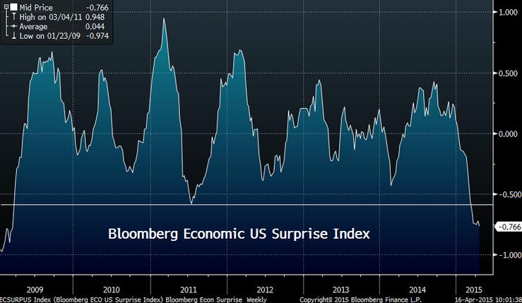
- Bloomberg Economic US Surprise Index
- Yardeni Global Growth Barometer & S&P 500

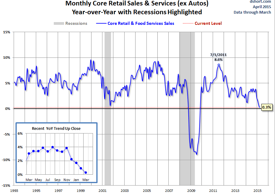
- Monthly Core Retail Sales
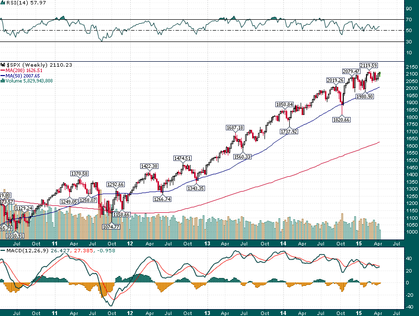
- S&P 500
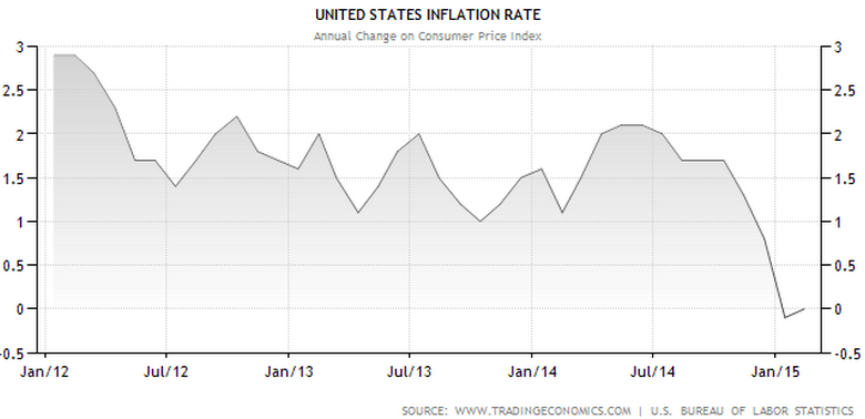
- US Inflation Rate
What do you guys think? I would have to say the 4th chart looks quite different from the others, however, it looks oddly similar to the following chart:

(Via Yardeni Research)