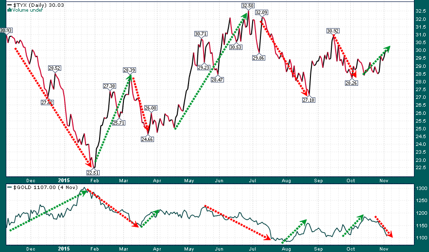
Aside from drawing arrows in Christmas colors the following chart serves to highlight an unmistakable relationship that has existed between Treasury yields and gold during the last year:
30-year US Treasury Bond Yield (top) vs. Gold (bottom)
The inverse correlation between Treasury yields and gold has been pronounced and growing stronger (currently at nearly a 90% inverse correlation). The strength of this relationship has now gotten to the point that gold traders/investors can simply look to Treasury yields (10-year note and 30-year bond) to figure out where gold is trading and which direction it has moved on a given day. However, who knows how long this correlation will last?…
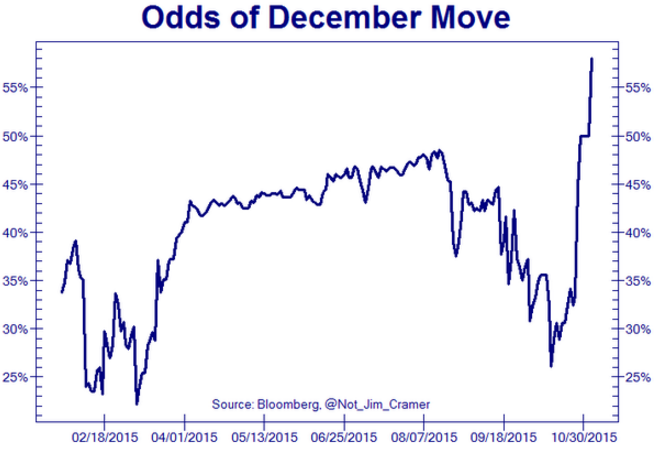
We have seen gold sell-off aggressively during the last week after the market suddenly became convinced that the Fed will move to raise the Fed Funds Rate at its next meeting in December:
Tomorrow’s monthly employment report is likely to be the deciding factor in whether the Fed takes action at its December meeting. The market has spent the last week pricing in a much stronger employment report and a much greater chance of a rate hike at the December meeting. Now we will have to see if the market has yet again set itself up for a disappointment.
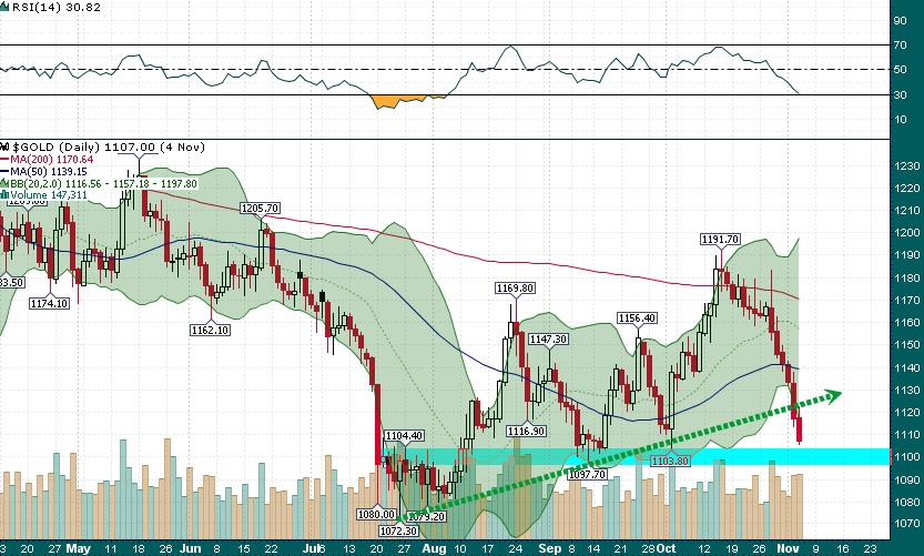
Meanwhile, gold is at an important technical juncture as it faces its 7th consecutive down day and potentially the 3rd consecutive close below its lower 2-standard deviation Bollinger Band:
Gold (Daily)
The uptrend from the July low was decisively breached this week and now all that’s really left is the support near $1100 and the July low at $1072. However, I would have to say that if $1100 gets cleanly breached then $1072 doesn’t offer much chance of holding up as support again. Gold is truly facing a big test over the next 24 hours and how the yellow metal finishes this week is likely to tell us a lot about the final two months of the year.


