
The S&P 500 briefly fell below its rising 200-day simple moving average last week and flirted with breaking the neckline of a multi-month head & shoulders top pattern:
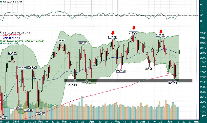
Bears might have thought that the Shanghai market crash or the threat of a ‘Grexit’ would surely sink a wobbly market that has been in the process of topping for much of the year. However, the last couple of trading sessions have proven exactly the opposite. The US equity market is incredibly resilient and each time that the situation has looked bleak, it has proven to be a great time to add long exposure.
The following chart explains a lot:
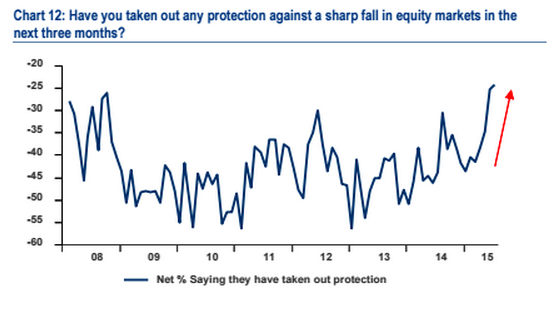
Simply stated, markets tend to fall when people are least expecting it, not when market participants are the most hedged they have been since late-2008….